Onboarding
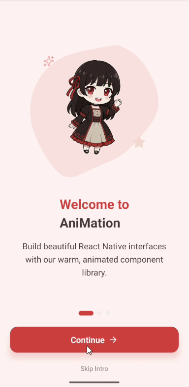
A beautiful multi-screen onboarding flow with swipeable pages, smooth scroll-driven animations, mascot entrance effects, and animated pagination dots.
9:41
signal_cellular_altwifibattery_full
Installation
$
Usage
Example.tsx
import { Onboarding } from './components/Onboarding';export default function App() {const handleComplete = () => {console.log('Onboarding completed!');// Navigate to main app};const handleSkip = () => {console.log('User skipped onboarding');// Navigate to main app};return (<OnboardingonComplete={handleComplete}onSkip={handleSkip}/>);}
Full Component Code
Onboarding.tsx
1import React, { useState } from 'react';2import {3 View,4 Text,5 StyleSheet,6 useWindowDimensions,7 TouchableOpacity,8 SafeAreaView,9 Platform,10 StatusBar,11 Image,12} from 'react-native';13import Animated, {14 useSharedValue,15 useAnimatedStyle,16 withTiming,17 withRepeat,18 withSequence,19 Easing,20 runOnJS,21 useAnimatedScrollHandler,22 interpolate,23 interpolateColor,24 Extrapolation,25 useAnimatedRef,26} from 'react-native-reanimated';27import Svg, { Path } from 'react-native-svg';28import { ArrowRight, Sparkles, Star, CheckCircle, Zap, Palette, Code } from 'lucide-react-native';2930const PRIMARY_COLOR = '#D94F3D';31const SECONDARY_COLOR = '#FFDBCF';32const TEXT_COLOR = '#4A3B39';33const BACKGROUND_LIGHT = '#FFF5F2';3435interface OnboardingProps {36 onComplete?: () => void;37 onSkip?: () => void;38}3940export const Onboarding: React.FC<OnboardingProps> = ({ onComplete, onSkip }) => {41 const { width } = useWindowDimensions();42 const scrollX = useSharedValue(0);43 const scrollRef = useAnimatedRef<Animated.ScrollView>();44 const [currentIndex, setCurrentIndex] = useState(0);4546 // Intro & Sway Animation47 const introProgress = useSharedValue(0);48 const swayProgress = useSharedValue(0);4950 React.useEffect(() => {51 introProgress.value = withTiming(1, { duration: 1000, easing: Easing.out(Easing.quad) }, (finished) => {52 if (finished) {53 swayProgress.value = withRepeat(54 withSequence(55 withTiming(1, { duration: 1500, easing: Easing.inOut(Easing.quad) }),56 withTiming(-1, { duration: 1500, easing: Easing.inOut(Easing.quad) })57 ),58 -1,59 true60 );61 }62 });63 }, []);6465 const scrollHandler = useAnimatedScrollHandler({66 onScroll: (event) => {67 scrollX.value = event.contentOffset.x;68 },69 onMomentumEnd: (event) => {70 runOnJS(setCurrentIndex)(Math.round(event.contentOffset.x / width));71 }72 });7374 const handleNext = () => {75 if (currentIndex < 2) {76 scrollRef.current?.scrollTo({ x: (currentIndex + 1) * width, animated: true });77 setCurrentIndex(currentIndex + 1);78 } else {79 onComplete?.();80 }81 };8283 // ... Slide rendering and styles (see full template)84 return (85 <SafeAreaView style={styles.container}>86 <StatusBar barStyle="dark-content" backgroundColor={BACKGROUND_LIGHT} />87 <Animated.ScrollView88 ref={scrollRef}89 horizontal90 pagingEnabled91 showsHorizontalScrollIndicator={false}92 onScroll={scrollHandler}93 scrollEventThrottle={16}94 >95 {/* Slides with mascot, features, and completion screen */}96 </Animated.ScrollView>97 {/* Footer with pagination dots and buttons */}98 </SafeAreaView>99 );100};101102const styles = StyleSheet.create({103 container: {104 flex: 1,105 backgroundColor: BACKGROUND_LIGHT,106 },107 // ... additional styles108});
Props
| Name | Type | Default | Description |
|---|---|---|---|
| onComplete | () => void | - | Callback when onboarding is completed |
| onSkip | () => void | - | Callback when user skips the intro |